Three Easy Ways to Choose Black & White Or Color

Three Easy Ways to Choose Black & White Or Color
Ah, the age-old question. Black and white or color?
Ansel Adams
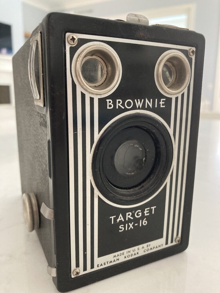
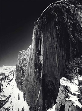
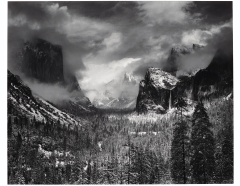
If you’ve ever taken a photography class or are a huge photography nerd like me, you’ve definitely heard of Ansel Adams. For those who don’t know, he was an iconic landscape photographer from the 1920s to the late 1970s and is known for his black and white landscapes of western national parks. His most influential photograph for me (and for many other photographers) is one from Yosemite National Park titled “Monolith: The Face of Half Dome, 1927.” He took this photo with a Kodak Brownie camera and used a dark red filter to get the deep contrast you see between the shadows and the bright sun reflecting off the mountain. Another one of my favorites is “Clearing Winter Storm”, Yosemite National Park, California 1944.
“Our lives at times seem a study in contrast… love & hate, birth & death, right & wrong… everything seen in absolutes of black & white. Too often we are not aware that it is the shades of grey that add depth & meaning to the starkness of those extremes.”
Ansel Adams
Adams was hesitant to delve into color photography as it became more popular, but he knew this “beguiling medium” was going to be huge. Developing color film is notoriously tricky (they wouldn’t even let us do it in modern-day high school) and was a hit-or-miss process when it was first introduced in the 1930s. Adams had trouble with the developing process despite being a pro in the darkroom, but he went on to produce incredible color photos, some of which were featured in Kodak’s “Colorama” display at the Grand Central Terminal in New York City. He judged these massive prints as “aesthetically inconsequential but technically remarkable,” showing disdain for the subject of the prints while admiring their enormous proportions. There’s a great article here in the Smithsonian about his interest (or lack thereof) in color photography if you want to read more!
“When words become unclear, I shall focus with photographs. When images become inadequate, I shall be content with silence.”
Ansel Adams
William Eggleston
On the other end of the spectrum, we have William Eggleston, known as the “Father of Color Photography.” Like Adams, Eggleston started out working with black and white film, and it wasn’t until the mid-1960s when he really started experimenting with color film and a process called dye-transfer printing, which resulted in a much more saturated color than other printing methods. According to this article by James Maher, one of his most famous prints, The Red Ceiling, was at the house of Eggleston’s best friend T.C.:
“a drug addicted dentist who would be murdered by an axe to his head at home, and the house set on fire – possibly due to drugs.”
Now that’s the drama I’m looking for here!
Eggleston’s photos are of common, everyday scenes such as the inside of his freezer or an empty parking lot. My favorite of his is someone stirring a drink on a plane – that 70s style is unmatched, and look at all that leg room! I wonder how his photos were perceived by people during the time he took them, because everyone was living that life. The pink tiled bathrooms, the beige living room furniture, and the classic Coca Cola signs. It all probably seemed trivially common and boring to people back then, but looking at these photos today I feel like he captured a slice in time where we could step into his daily life and experience the things he saw and did.
“Whether a photo or music, or a drawing or anything else I might do—it’s ultimately all an abstraction of my peculiar experience.”
William Eggleston
So, which is it?
So where does this bring us? Black and white or color? The answer is… (drumroll please)… there is no answer. I mean, come on, were you expecting me to have some magic wand to wave that says “this photo should be color” or “this photo should be black and white”?
In all seriousness, I do have some criteria that I personally use when choosing to provide clients with black and white photos, and I usually give them the color version as well so they can choose for themselves. All of the statements below are my own opinion and are by no means rules! I’ll start off with saying that my default is to edit all my photos in color first. Then, I go back and pick out a couple photos that might look good in black and white and I’ll end up with just a few black and white photos for each photoshoot (if any).
1. Black and white looks better on a photo with some movement in it than on a posed, still image.


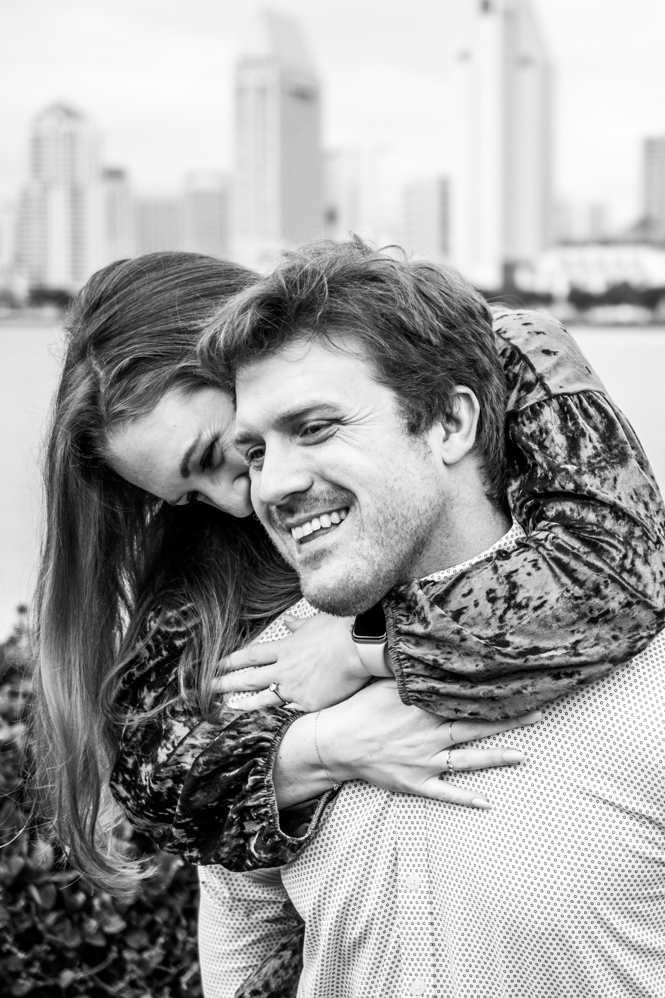
Let’s take this photo, for example, of my friends Sarah and Andrew who got engaged last December (yay!). In this photo, Andrew was swinging Sarah back and forth on his back. You can tell that this image isn’t posed and that this photo captured them while moving. In my opinion, the black and white “freezes” that movement better than color and provides a more powerful picture.

2. Black and white can sometimes be used to save a photo that is overexposed.
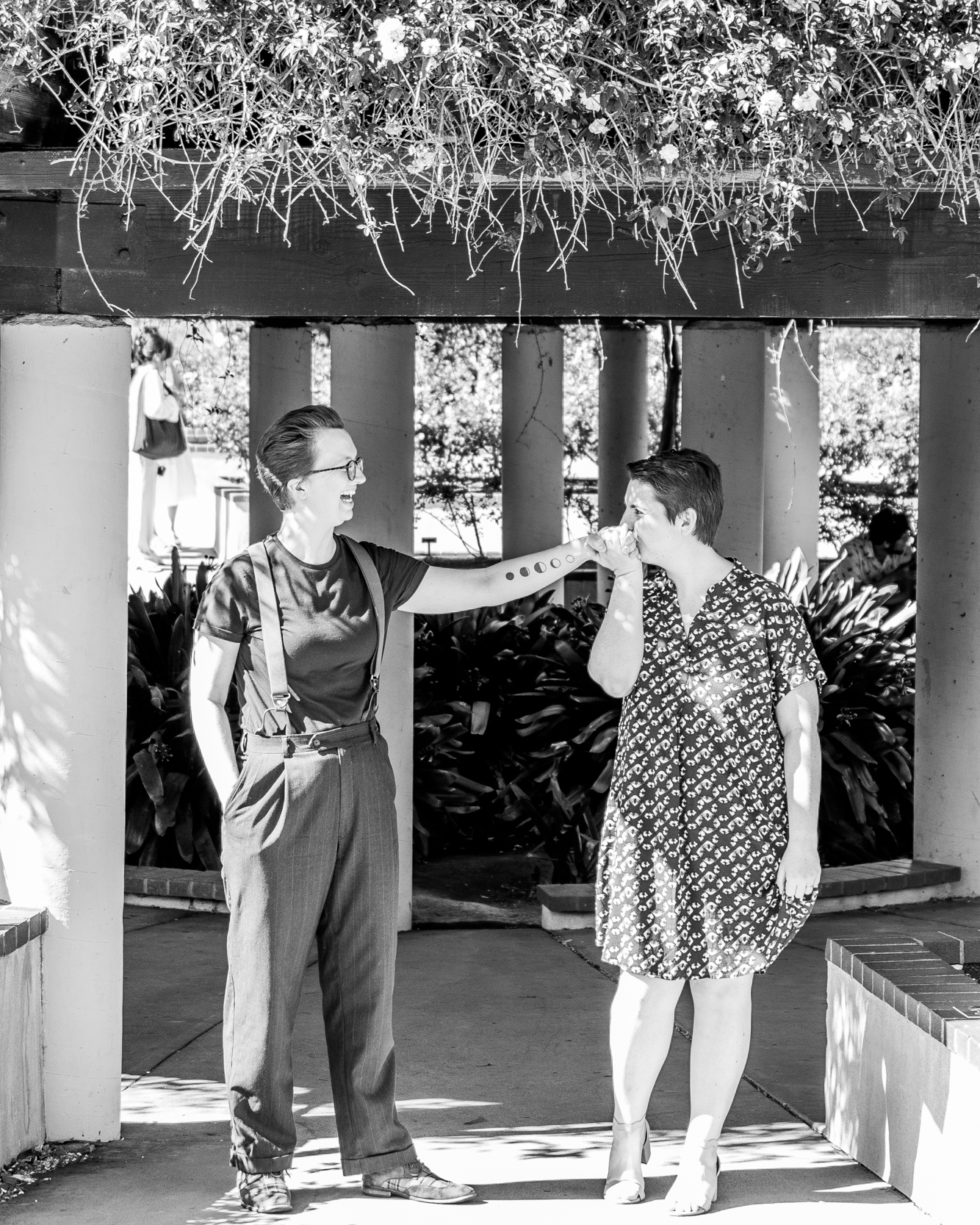
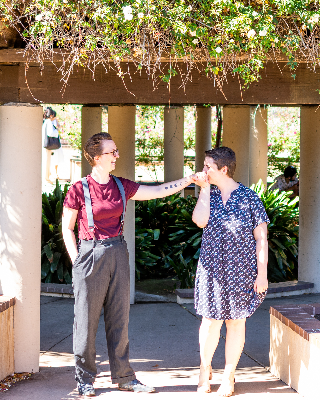
I’ll start off with saying that I love this photo in both black and white and color, and I did end up providing them with just the color version, but this is a good example of an overexposed photo with some tricky lighting. These are my friends Elaine and Rae during their engagement shoot at the Inez Grant Parker Memorial Rose Garden at Balboa Park. We had some really harsh sunlight on this day, and in hindsight I would have had them step backwards into the shadow of this overhang so that the light was even on their bodies. The photo itself was overexposed and I had to do quite a bit of editing to get it to this state. There are still sunlight hotspots on their arms and legs, and it washes out the details in those areas. The black and white makes those hotspots less obvious and will give the black and white photo more contrast. However, this photo violates my next rule below, so overall it’s just not a great photo (except Elaine and Rae look fabulous and it was my fault for not getting this one right).
3. Color looks better when there is a busy or distracting background
This photo is from Jenny and John’s elopement and we took their photos in a botanical garden. There are so many plants in the background of this photo that when it’s put in black and white, it gets harder to distinguish the subjects from the background. When it’s in color, the green of the plants helps the subjects to stand out more and your focus goes straight to them.


From Ansel Adams to William Eggleston, I think there’s a place for color and black and white in every photographer’s portfolio. I hope you enjoyed reading this (if you made it this far!) and please let me know if you have any tricks or tips that you use for choosing black and white or color! If you haven’t already, subscribe to this blog so you can get them delivered straight to your inbox, and as always, you can contact me on Facebook, Instagram, or send me an email. Next week’s blog will be about photographing my friend’s baby shower and we get to revisit that enormous charcuterie table!
Let’s create some memories.
Kim
P.S. If you’ve been following along on Facebook or Instagram this week, I showed a series of black and white photos side-by-side with their color versions and asked which ones you liked best. Here is what I chose for each of them and why:
- Color. But I really could have gone either way. I think the grass in the background could become too distracting for B&W.
- Color. I explained this one above for point #2.
- B&W. I love the contrast with this one and there’s movement in this photo so it helps freeze the moment.
- B&W. I explained this one above for point #1.
- I could go either way with this one. I love the purple hues in the color photo, but I love the contrast in the B&W.
- Color. I explained this one above for point #3.
- Color. The light around her is so beautiful, you just don’t get that same effect with B&W.
2 Responses
Kim, does the subject make a difference in b/w vs. color? These Ansel Adam’s pics are shots of nature.
I think it definitely does, a landscape photo can be much more subjective and depends on the mood, location, and time of day. For example, you wouldn’t want to put a picture of a garden in black and white because you would miss all the detail in the flowers. But if the garden was dead or burnt, putting it in black and white changes the mood completely. Using black and white can also extend the usable hours of the day for landscape photography – we typically use sunset, dusk, or dawn to get the best light where the sun is at an angle or the light is more even across the landscape. If you’re shooting on a rainy day or when the light is really uneven, black and white can help create a better photo, sort of like in my point #2. I found a really nice article describing this here: https://www.capturelandscapes.com/six-reasons-must-use-black-white-landscape-photography/